
Fonts used for print
UNT has a family of brand fonts, which includes primary fonts Adobe Jenson and Helvetica Neue. For those who may not have these fonts available to them, you may use Centaur MT to replace Adobe Jenson or Arial to stand in place of Helvetica Neue.
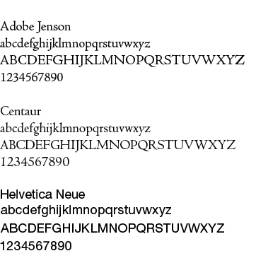
We use Adobe Jenson and Centaur to represent the formal and collegial aspect of UNT. These are both serif fonts, which are seen as more traditional and formal by the majority of the public. A good usage example for Adobe Jenson is when our communication or a part of our communication needs to be perceived as the voice of the university, such as in a headline for an advertisement for a job posting or in the body copy of a printed fundraising publication. These fonts were the starting point for designers who worked to develop the university’s lettermark and wordmark.
Helvetica Neue and Arial are used to represent the university in a contemporary and informal way. These are both sans serif fonts, which are perceived by the public as modern and contemporary. A good usage example for Helvetica is a headline for general advertising or posters. Helvetica Neue works well for way-finding pieces such as university yard signs.
Additionally, font choices are used to communicate conceptual ideas in communications. And while Adobe Jenson, Helvetica Neue and their alternates are the primary fonts for UNT, there are some exceptions and allowances for creativity in your communications.
If you do not own the fonts, please contact UBSC for guidance at 940-565-2108. Please do not purchase the fonts on your own without contacting UBSC.
Fonts used for web
The UNT web template we use also includes fonts that support the UNT brand and creates visual consistency for all sites across the unt.edu domain. The UNT web template includes style sheets that use the appropriate web fonts that have been selected.
In the event that web-based software from an outside vendor is purchased and needs to be configured, the fonts that are used on UNT web sites are:
- Open Sans Condensed is the font used for section headings that divide body copy. It is an open source font from Google that can be automatically installed for web visitors that do not have it available and creates consistency across UNT sites.
- Open Sans is used to display the site name in the header at the top of the page and is the main font selected for web body copy. It pairs nicely with Open Sans Condensed and reads easy at all display sizes.
- Montserrat is used sparingly, in the footer and other places where you might see all-caps at a small size.
- FontAwesome is used anywhere you see an icon, that is not an actual reference to an image file. Will appear in the codebase as <i class="fa fa-icon"><i>.